
Style
Guide
This is how Culture Pilot shows up — the marks, the colors, the type and the treatments that make the brand recognizable everywhere it appears. Use it as the source of truth for anything built under the Culture Pilot name.
Download the style guide (PDF)- Primary color
- #FF266C
- Display type
- Bebas Neue Pro
- Body type
- Montserrat
Core marks
Four approved lockups. The horizontal wordmark is the default; use the stack when width is limited, the profile block for social avatars, and the standalone mark only where the brand is already established.
Primary horizontal
The default lockup. Use it in headers, footers, signage and anywhere the full name should read at a glance. Minimum width: 120px on screen, 1.25in in print.


Stacked lockup
For square and narrow spaces — merch, stamps, tight column layouts. Never re-stack the horizontal version yourself; use this file. Minimum width: 90px.

Profile block
Social avatars and app icons. The mark sits reversed in a solid black square with fixed padding — do not crop it tighter or change the background color.

Standalone mark
The orbit-and-arrow emblem on its own. Reserve it for favicons, watermarks and repeat patterns where the full name already appears nearby. Minimum width: 24px.

Clear space
Keep a margin equal to the height of the emblem on all four sides. Nothing — type, imagery, edges or other logos — enters that zone.
Minimum sizes
Below these widths the emblem's inner counters fill in and the logo stops reading.
HorizontalHorizontal · minimum 120pxMark · minimum 24pxPalette
Culture Pilot lives on white. Magenta does the pointing, black does the weight, and everything else appears in small, deliberate doses. Click any value to copy it.
Core
The signature Culture Pilot identity. Magenta is the brand's voice; black and white carry the rest.
Magenta
Primary brand accent. Calls to action, highlights, active states.
- HEX
- RGB
- CMYK
Black
Logo artwork, display type, black tags and full-bleed panels.
- HEX
- RGB
- CMYK
White
The dominant canvas. Culture Pilot layouts are built on white.
- HEX
- RGB
- CMYK
Secondary
Used sparingly for contrast — offset shadows on display type, diagrams, and accent moments.
Taupe
Warm mid-tone for subtle structure, dividers and quiet fills.
- HEX
- RGB
- CMYK
Linen
Soft warm neutral for section backgrounds and card fills.
- HEX
- RGB
- CMYK
Cyan
Counterpoint to magenta. Offset type shadows and data accents.
- HEX
- RGB
- CMYK
Deep Purple
Subheadings and a grounded third accent against magenta.
- HEX
- RGB
- CMYK
Neutrals
Everything type sits on. Bone is the warm background; Mist is the cool one.
Ink
Body copy and long-form reading text.
- HEX
- RGB
- CMYK
Logo Black
The exact black inside the logo artwork files.
- HEX
- RGB
- CMYK
Bone
Warm section background. Pairs with photography.
- HEX
- RGB
- CMYK
Mist
Cool section background and card fills.
- HEX
- RGB
- CMYK
Type system
Two families do all the work. Bebas Neue Pro SemiExpanded is the voice — condensed, uppercase, confident. Montserrat is the messenger — neutral, legible, generous in line height.
Bebas Neue Pro
SemiExpanded width, licensed through Adobe Fonts. Weights in use: Regular, SemiBold, Bold. Always uppercase. Never letterspace below 0; open it to 0.02–0.03em for small caps-style labels.
Web fallback: Bebas Neue (Google Fonts), then Arial Narrow.
Montserrat
Weights in use: Regular 400, Medium 500, SemiBold 600, Bold 700. Body copy sits at 16px with a 28px line height — never tighter. Micro labels drop to 9px with 1px letterspacing, uppercase.
Web fallback: system sans-serif.
Display / H1
Bebas Neue Pro SemiExpanded
80px · Bold · 73px line · Uppercase
Culture is human.
Headline / H2
Bebas Neue Pro SemiExpanded
43px · Regular · 46px line
Branding & Marketing
Subhead / H3
Bebas Neue Pro SemiExpanded
24px · SemiBold · Uppercase · 0.02em
Retail Brand Development
Body
Montserrat
16px · Regular · 28px line
We believe in building culture-first brands through clever design and strategic marketing. No matter the size, no matter the industry.
Nav / Micro label
Montserrat
9px · Medium · Uppercase · 1px tracking
Services Results Ethos Market Insights
Character set
ABCDEFGHIJKLMNOPQRSTUVWXYZ 0123456789 &?!@#$%
ABCDEFGHIJKLMNOPQRSTUVWXYZ abcdefghijklmnopqrstuvwxyz 0123456789
The offset shadow
A signature Culture Pilot treatment: large display type with a 1px offset shadow in magenta and cyan. Reserve it for hero headlines only — one per page, never on body copy.
Brands with a pulse
Interface kit
Square corners, hairline rules, uppercase micro-labels. Culture Pilot interfaces are built from lines and space rather than boxes and shadows.
Buttons
Zero border radius everywhere. Labels are Montserrat 9px, medium, uppercase, 0.14em tracking. Hover reduces opacity rather than changing color.
Rules & arrows
The 1px crimson rule is the connective tissue of the brand. It separates navigation items, brackets section labels and caps full-bleed sections top and bottom.
Cards & tags
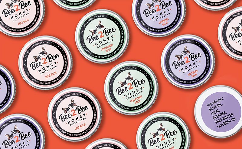
Retail Rebrand and Packaging for Local Honey
Case study cards pair a full-bleed image with a black tag that overlaps the image edge, then a magenta descriptor line in display type. No rounded corners, no drop shadows, no gradient overlays.